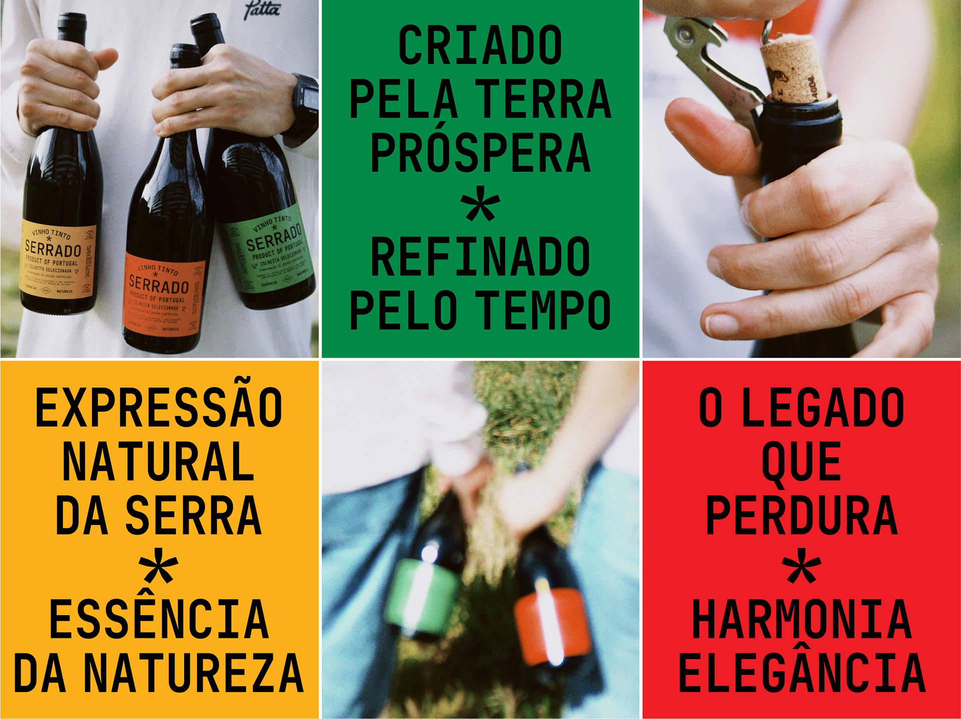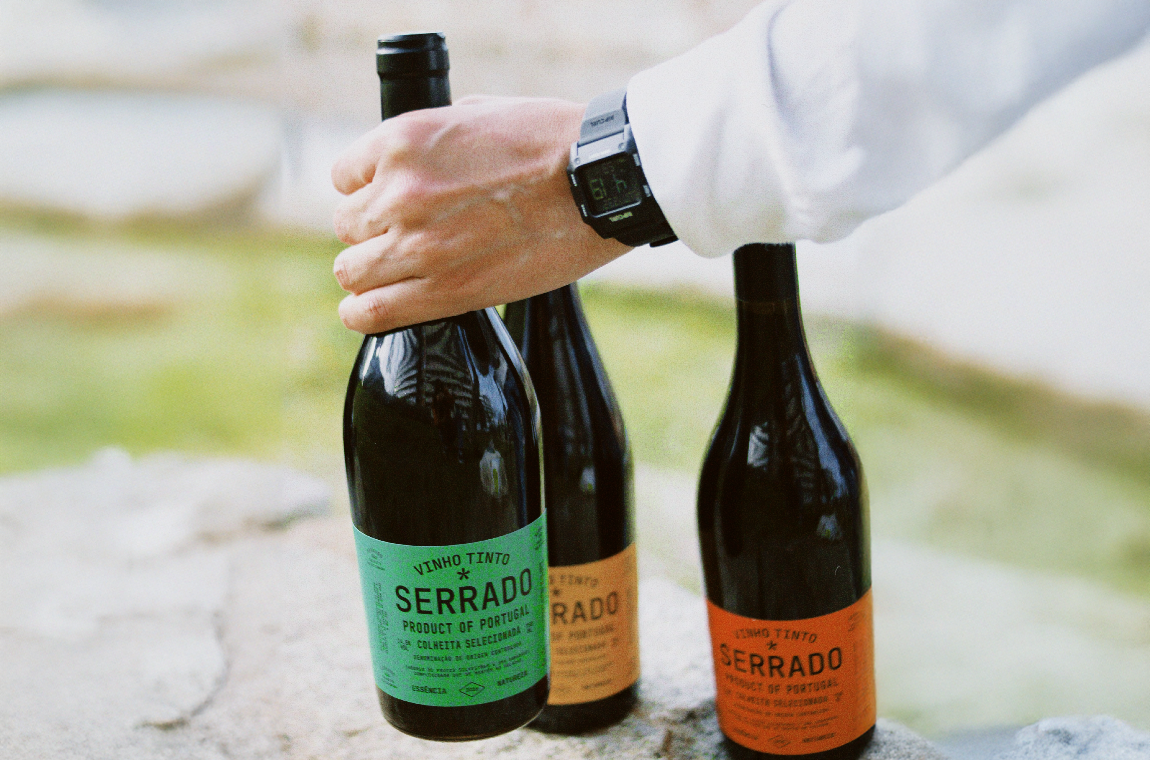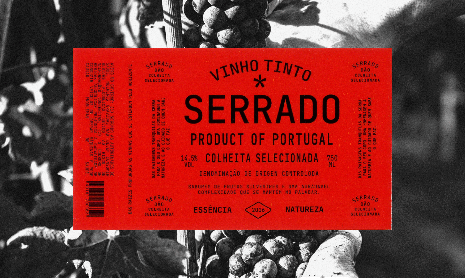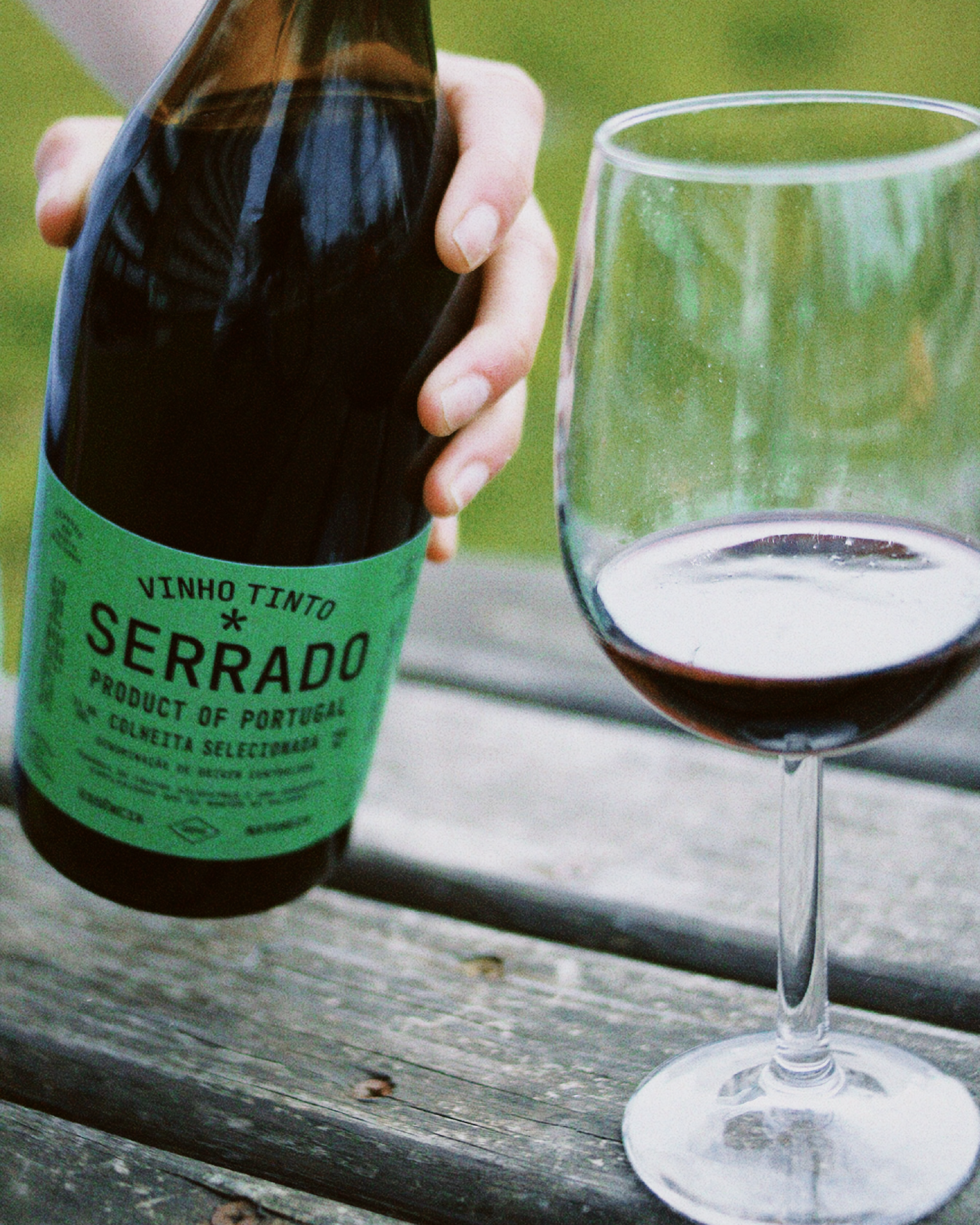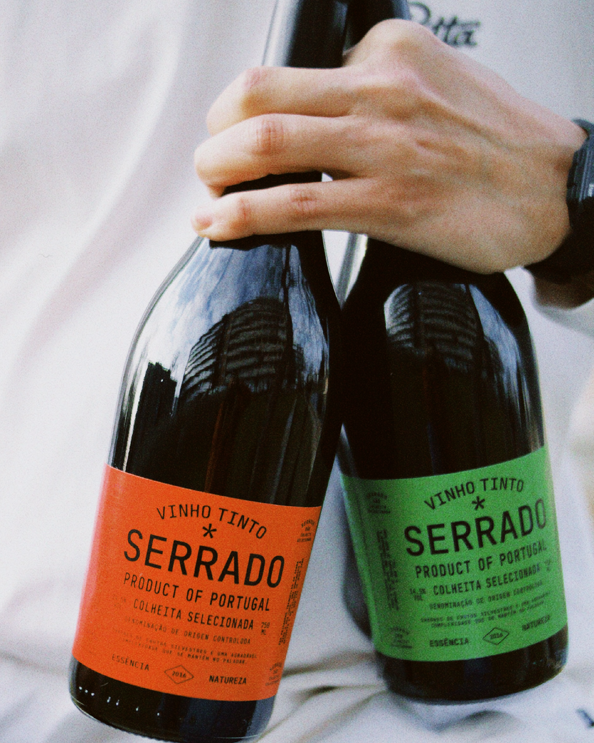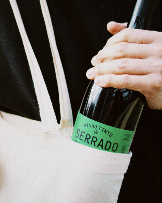

Visual identity and label design for Serrado wine from Portugal’s Dão region. Inspired by the land, tradition, and character of the wine.
The label design embraces a bold yet minimal approach, with a structured typographic layout that reflects authenticity and elegance. The color palette is deeply connected to the natural landscapes of Dão, drawing inspiration from the region’s soil, vineyards, and surrounding hills. The tones evoke the richness of the terrain, the seasonal shifts of the vines and the deep connection between the wine and its place of origin. This organic harmony reinforces the brand’s identity, capturing the essence of tradition, craftsmanship, and the passage of time.
Location: Portugal
Fonts in use: JetBrains Mono by Sergey Dmitriev, Valentin Kipyatkov and Eugene Belyaev & Helvetica Neue by Max Miedinger